
Why Your Phuket Website Isn't Getting Bookings
Traffic but no bookings? Here are the real reasons a Phuket hotel, villa or restaurant website fails to convert — and how to fix each one.
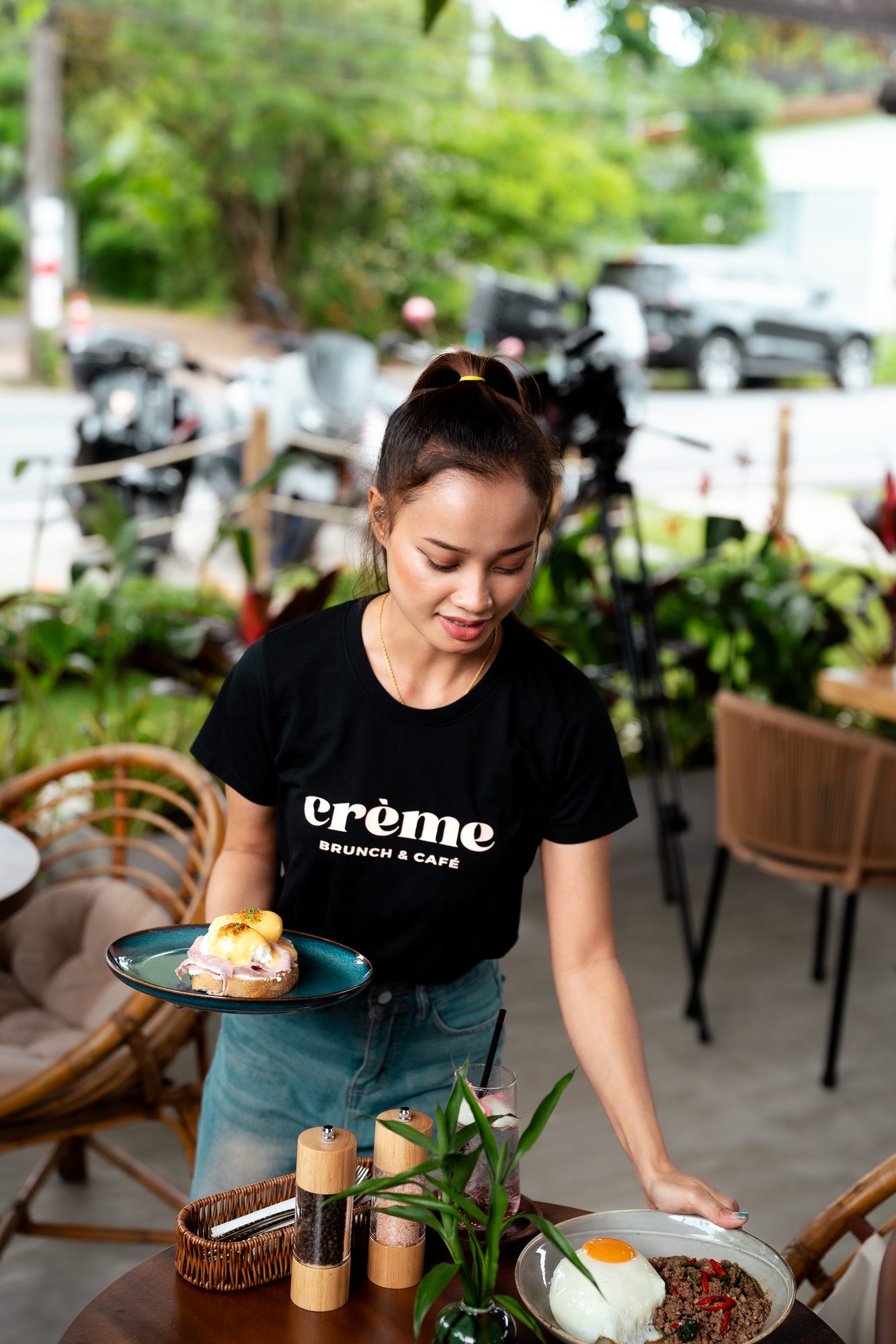
Here’s a conversation we have a lot. A venue tells us their marketing isn’t working. We look. The marketing is fine — people are arriving. They’re just leaving again without doing anything.
That’s not a traffic problem. That’s a website not converting, and it’s usually fixable in an afternoon or two.
The visitor gave you eight seconds. What did they get?
Someone lands on your homepage from an Instagram link, on a phone, on hotel wifi, half distracted. In those first few seconds they’re answering three questions: What is this? Is it for me? What do I do next?
If your homepage opens with a full-screen video, an autoplaying slideshow and a headline that says “Where Moments Become Memories,” they’ve answered none of them. They’re gone.
Say what you are, where you are, and what makes you worth the trip. “Beachfront Italian in Bang Tao. Open for lunch and dinner.” Nobody has ever bounced because a website was too clear.
There’s no obvious next step
Scroll your own site. Count how many times a visitor is invited to actually do something — book, reserve, enquire, call.
On most sites we audit, the answer is once, buried in the navigation, in the same weight as everything else. Your booking action should be present, obvious and repeated. Top right of the header. Again after the first block of content. Again at the bottom. On mobile, sticky at the base of the screen.
And make the words specific. “Reserve a table” beats “Book now.” “Check availability” beats “Learn more.” The more concrete the promise, the more people take it.
It’s slow, and slow is silent
A site that takes six seconds to load on a phone in Rawai loses a meaningful share of its visitors before they see a single image. They don’t complain. They don’t email you. They just go back to Maps and pick someone else.
The usual culprits are enormous uncompressed photos, a pile of plugins, and video that loads whether or not anyone watches it. The fix is boring and effective: compress images properly, serve modern formats, load video only on click, and cut what you don’t need.
Test it on 4G, not your office fibre. That’s the real experience.
The photography is undermining you
You can be a genuinely beautiful venue and still look average online. Dim phone photos, inconsistent colour, a hero image from a different season — all of it quietly signals “this place is fine” when you need it to signal “book this immediately.”
People are buying an experience they can’t see yet. The photography is the product page. This is the part of a website where money spent shows up most directly in bookings, and it’s the part people cut first. Have a look at how a consistent set of images changes the read of a venue in our work.
You’re asking for too much, too early
Every extra field in an enquiry form costs you responses. If someone has to give you their full address, party size, dietary requirements and passport number to ask a question, they won’t ask.
Take the minimum: name, contact, dates or date, a message box. You can gather the rest in the reply — by which point they’re already in a conversation with you.
Mobile was an afterthought
Most of your traffic is on a phone. Quite a lot of it is on a phone in the sun, one-handed, with a drink in the other.
Check the basics on an actual device: is the text readable without pinching, are buttons big enough for a thumb, does the menu open, does the phone number dial when tapped, does the map link open Maps. Tiny things, but each one is a place where a booking quietly dies.
Nothing on the page says “other people did this”
Trust is what closes it. A wall of quiet, tasteful proof does more than any amount of adjectives: a Google rating with the review count, two or three short quotes with real names, the logos of publications that covered you, an award if you’ve got one.
Don’t hide it on a testimonials page nobody visits. Put it near the booking action, which is exactly where hesitation happens.
The OTA is eating your margin because your own site is worse
For hotels and villas especially, the honest reason guests book on an OTA is that the OTA experience is better. Faster, clearer, with real photos, real reviews and a price they can see.
You don’t have to beat their scale. You have to beat their offer on your own turf: a best-rate guarantee, a perk they can’t get elsewhere, and a booking flow that doesn’t feel like filing a tax return. The margin you claw back is worth far more than the build.
Fix them in this order
If you only do a few things:
- Make it clear what you are, in the first screen
- Put an obvious booking action in three places
- Compress the images and kill the autoplay video
- Replace the worst five photos with good ones
- Cut your form down to four fields
That’s most of the gap, most of the time.
If you want a straight answer on what’s holding your site back, send it to us. We’ll tell you honestly — including if the answer is “not much, spend the money elsewhere.”